The Back Story
Bob Tisdale is a guy who makes a lot of charts and posts them on his own blog. Google his name and you can't miss it, or his graphics. He generally also cross-posts his work to WUWT, which is where I normally read him. A few days ago he wrote a post entitled Alarmists Bizarrely Claim “Just what AGW predicts” about the Record High Global Sea Surface Temperatures in 2014. It contains no fewer than 28 plots showing a bunch of stuff having to do with CMIP5 sea surface temperature output vs. observations from roughly 1982 to present. Why that date range? I'll let him explain:PRELIMINARY INFORMATIONSo far, so legit. But I'm getting ahead of myself here, because the only chart that matters here is the first one in the deck, which actually makes its appearance before the PRELIMINARY INFORMATION section:
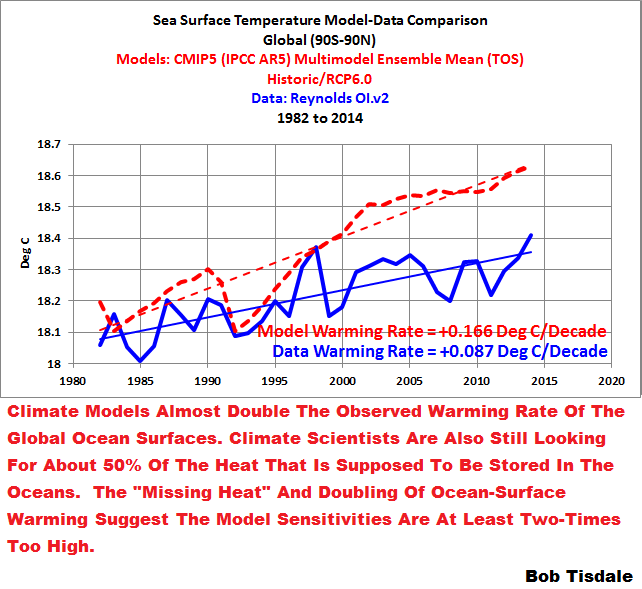
The sea surface temperature dataset being used in this post is NOAA’s Optimum Interpolation (OI) Sea Surface Temperature (SST) v2 (aka Reynolds OI.v2). We’re using it because (1) it is the longest running satellite-enhanced sea surface temperature dataset available, (2) its satellite data are bias adjusted based on temperature measurements from ship inlets and from buoys (both moored and drifting), and (3), most importantly, NOAA’s Reynolds OI.v2 data have been called “a good estimate of the truth”.
Now Hold on a Minute
Why are we comparing CMIP5 to observed SSTs using absolute temperature? Who does that? Again, I allow Bob to explain his unorthodox approach:We’re taking a slightly new direction by presenting sea surface temperatures (modeled and observed) in absolute form, not anomalies, in the time-series graphs. Sea surface temperature anomalies are still used, however, for the trend maps and for the graphs showing trends on a zonal-mean (latitude-average) basis.As if I weren't already beginning to smell a rat. As you will soon discover, I'm being kind to Bob with that comment.
The initial reason for the switch to absolute sea surface temperatures was the unwarranted complaints about the model-data comparison I’ve been presenting recently, in which the models and data are shifted so that the trend lines intersect at zero in the first month of the time-series graph. See Figure 1. As you will soon discover, I’m being kind to the modelers with that graph.
The Real Story
One can't just willy-nilly compare absolute model/observation temperatures to each other and expect it to work. One of the many reasons to use anomalies is for that very reality. So I trotted off to KNMI Climate Explorer, grabbed the relevant data and plotted them. Looked exactly the same as Bob's chart.Then I asked myself, "Gee, it couldn't possibly be that Bob really likes Reynolds OI.v2 because it reads lower absolute than other SST products ... could it?"

He really is that brazen. He's just manufactured one full standard deviation of divergence between models and actuals. This will never do.
Yo, Can I Axe You a Question?
Data downloaded, plots generated, I fire off a few questions:1) What would it look like if you did the appropriate anomaly calculations for the 1986-2005 reference period the IPCC uses when comparing CMIP5 ensemble output to observations?Not one to be helpful when someone asks critical questions of him, Bob writes back ... nothing ... but taking twice as many words to do it:
2) Since climate is the study of long-term weather patterns, why limit the analysis to the period of time covered by Reynolds OI v2 SST (1982-present) when other longer-term observational timeseries are available? For instance the HadISST1 1° reconstruction, available on KNMI Climate Explorer, runs from 1870-present. Like Reynolds OI, the HadISST1 data are available in absolute °C, so if we must dispense with anomalies for this analysis, it might be useful to get the long-term perspective from a product with more temporal coverage.
I’ll be interested to see the results of your further, more representative, analysis. Thanks.
Brandon: (1) Obviously, once again, you did not read or comprehend my post. It’s a really simple post. It presented sea surface temperatures, not anomalies. You’re more than welcome to prepare a blog post presenting anomalies and offer it to Anthony. If you want to replicate each of my graphs using anomalies, feel free, but you could save your time by looking at the post from last year. It’s linked in the post above. Very little has changed, other than the uptick in the extratropical North Pacific.
(2a) Why focus on the past 33 years? you wondered. The answer’s blatantly obvious to most of us. If the models can’t simulate the actual warming and cooling rates of the ocean surfaces, the spatial patterns of those trends, or the absolute surface temperatures of the oceans over the past 33 years, they have no value at predicting future climate.
(2b) I linked a detailed analysis of a long-term sea surface temperature dataset in anomaly form in the post. Obviously you missed it or you wouldn’t have asked. So your request was another indication that you hadn’t bothered to read or comprehend what was written or attached. If you’re not aware, the models performed very poorly over the long term in anomaly form. Do you really think that presenting them in absolute form will make them look better?
Where do We Go from Here?
Some more back and forth. A few WUWT loyalists get into it. By my count Bob hasn't done the comparison I've asked of him three times now. It really should be obvious why.So I don't know where it goes next. Updates as they happen, I guess.
Update: I Get a Decent Question
I was asked to produce this plot:
And for comparison there is this:

Only difference is in the reference periods. The first plot is the proper 1986-2005 baseline, the second is Bob Tisdale's 1880-2014 baseline. So as not to "bias the results". Not a whole lot of difference ... this time. Still an interesting exercise nonetheless.
No comments:
Post a Comment